Creating Visual Breathing Room with Warm Neutral Palettes
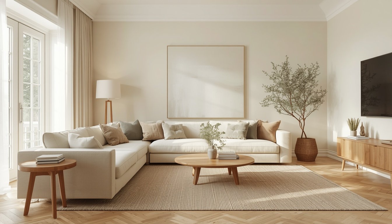
Have you ever walked into a room that felt calm, open, and effortlessly beautiful, even though it wasn’t particularly large? Often, the secret isn’t extra square footage or expensive furniture. It’s the way colors, textures, light, and empty space work together.
Warm neutral palettes can make a home feel softer, more inviting, and visually balanced. Shades of ivory, cream, beige, taupe, and warm greige create a gentle foundation that allows furniture, natural materials, and meaningful decorative pieces to stand out without overwhelming the room.
But creating a neutral interior isn’t simply about painting everything white or removing every accessory. The real art lies in knowing how to balance color, texture, furniture, and negative space so your home feels comfortable rather than bare.
Whether you’re decorating a small apartment or refreshing a larger living room, these practical ideas will help you create visual breathing room with warm neutral colors.
1. Start with a Warm, Cohesive Color Palette
The foundation of a calm interior is a color palette that feels connected from one area to the next.
Warm neutrals work particularly well because they can soften a room and create a welcoming atmosphere. Unlike stark white, which may appear cool in some lighting conditions, warm whites and creamy tones often introduce a subtle sense of softness.
Begin with two or three main colors and build from there.
Consider these warm neutral shades:
Warm ivory: A gentle alternative to bright white for walls, curtains, and larger surfaces.
Soft beige: Adds warmth to upholstery, rugs, and textiles.
Warm greige: Combines gray and beige for a subtle, understated neutral.
Natural oak: Introduces warmth and an organic quality through furniture and flooring.
Muted olive: Adds a restrained hint of color without disrupting the calm palette.
Soft charcoal: Provides definition through small accents, frames, or lighting details.
A simple approach is to use a light neutral as the foundation, a slightly deeper shade for furniture and textiles, and one restrained accent color to add character.
You don’t need to use every shade in every room. Choose colors that complement your existing finishes and repeat them thoughtfully to create a sense of continuity.
Design tip: Test paint samples on different walls before committing. Observe them in morning light, afternoon sunlight, and artificial lighting, because the same color can look noticeably different throughout the day.
2. Let Empty Space Become Part of the Design
One of the most effective ways to create visual breathing room is to leave some areas intentionally uncluttered.
In interior design, negative space refers to the areas around furniture, objects, and decorative features that remain visually open. These spaces give the eye somewhere to rest and help important elements stand out.
This doesn’t mean your home needs to feel empty. It means every surface doesn’t need to be filled.
Try these simple changes:
Leave some open space on coffee tables and countertops.
Avoid pushing too many decorative objects together on shelves.
Keep the area around major furniture pieces relatively clear.
Allow a statement chair, artwork, or beautiful lamp to stand on its own.
Leave some wall space empty instead of filling every section with pictures or shelves.
For example, a coffee table with one carefully arranged tray, a small vase, and a book can feel more intentional than a surface covered in many unrelated accessories.
The same principle applies to walls. One well-proportioned artwork can create a stronger focal point than several pieces competing for attention.
Design tip: Before buying more decor, remove a few objects from a crowded surface. Sometimes creating breathing room requires editing what you already own rather than adding something new.
3. Layer Different Textures to Keep Neutrals Interesting
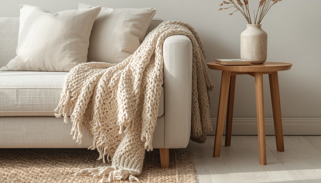
A neutral room can feel flat when every surface has the same color and finish. Texture adds depth without requiring a busy color scheme.
The goal is to create subtle contrast between smooth, soft, rough, and natural materials.
Here are some combinations to try:
Linen curtains with smooth painted walls.
A textured wool or cotton rug beneath a simple sofa.
Natural oak furniture paired with soft upholstered seating.
Woven baskets beside a clean-lined cabinet.
Ceramic vases on a wooden console.
Knitted throws and textured cushions against plain bedding.
These combinations make a room feel layered and lived-in while keeping the overall palette calm.
You can also vary the finish of materials. Matte walls, softly reflective ceramics, natural wood grain, and brushed metal introduce visual interest without overwhelming the room.
Design tip: Choose a few complementary textures rather than using every material at once. Repeating two or three finishes throughout a room helps the design feel cohesive.
4. Choose Furniture That Fits the Room
Even a beautiful neutral palette can feel crowded if the furniture is too large or the layout is poorly planned.
Visual breathing room depends partly on the amount of space around your furniture. Pieces that fit the room’s proportions allow the interior to feel more balanced and easier to move through.
Before buying furniture, measure the room and consider how people will walk between the main areas.
Look for these features:
Sofas with proportions suited to the available wall length.
Coffee tables that leave enough clearance around seating.
Side tables that provide function without unnecessary bulk.
Open-legged chairs and tables that reveal more of the floor.
Storage furniture that reduces the need for several smaller pieces.
Furniture raised slightly off the floor can make a room feel visually lighter because more of the floor remains visible. This effect is especially useful in compact living rooms and bedrooms.
However, don’t choose a piece simply because it looks light. Comfort, durability, function, and appropriate dimensions matter just as much.
Design tip: If a room feels cramped, try removing one unnecessary furniture piece or changing its position before replacing everything. A more thoughtful arrangement may be all you need.
5. Use Natural Light to Enhance Warm Neutrals
Light has a significant effect on how neutral colors appear. A creamy wall may look bright and soft in a sunlit room but deeper or more yellow in a dim corner.
Making the most of natural light can help a space feel more open and allow warm neutrals to show their subtle variations.
To make better use of daylight:
Choose curtains that allow light to filter through when privacy permits.
Keep window areas free from unnecessarily bulky furniture.
Use mirrors to reflect light where they have a useful view to reflect.
Avoid placing tall objects directly in front of important light sources.
Choose finishes that work with the room’s natural light rather than fighting against it.
Mirrors can help distribute reflected light and create a greater sense of depth, especially when positioned opposite or beside a window. The effect depends on the room’s layout and what the mirror reflects.
Artificial lighting matters, too. A combination of ambient lighting, task lighting, and accent lighting helps the room remain comfortable after sunset.
Warm-white bulbs can complement cream, beige, and natural wood tones, but the best color temperature depends on the atmosphere you want and how your paint and materials appear under the light.
Design tip: Test your chosen paint color under the lighting you’ll actually use. This can prevent a neutral room from appearing unexpectedly gray, yellow, or dull.
6. Use Rugs and Curtains to Create a Softer, More Open Feel
Textiles help a neutral interior feel comfortable and complete. They can also visually connect different areas of a room without introducing strong colors or heavy patterns.
Choose Rugs That Suit the Space
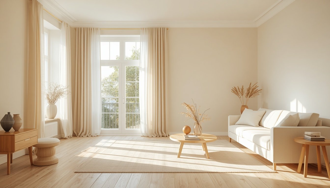
A rug helps anchor a seating arrangement and creates a visual boundary around the furniture. In a living room, a rug that accommodates at least the front legs of the main seating pieces often creates a more connected arrangement than a very small rug floating in the center.
Choose a shade that complements your flooring and upholstery. A textured ivory rug can soften a room, while a deeper beige rug can introduce subtle contrast.
Use Curtains to Emphasize Height
Curtains hung close to the ceiling and extending toward the floor can draw the eye upward and create a sense of height.
Lightweight linen-look or cotton curtains work well with warm neutral palettes because they soften the window without necessarily making it the room’s heaviest visual feature.
Measure carefully to ensure the curtains fit the window and don’t interfere with radiators, doors, or other fixtures.
Repeat Textures Across the Room
A beige cushion, a cream throw, and a textured rug can share a similar color family while offering different tactile qualities. Repeating these tones creates unity without making every fabric identical.
Design tip: Let textiles provide most of the softness in the room, then use a few carefully chosen accessories to add personality.
7. Add Natural Materials for Warmth and Character
Warm neutrals become more inviting when paired with natural materials. Wood grain, woven fibers, stone, clay, and linen introduce subtle variations that keep a room from feeling too uniform.
Natural oak is particularly versatile because it complements many shades of cream, beige, and greige.
Ways to incorporate natural materials include:
A wooden coffee table or bedside table.
Woven baskets for blankets or everyday storage.
Ceramic vases with simple, organic shapes.
Linen cushion covers or curtains.
A stone or wood tray on a console.
A small arrangement of branches or greenery.
You don’t need to fill every corner with natural objects. A few thoughtfully selected materials can create enough contrast to make the space feel layered and personal.
Plants can also introduce a gentle green accent, especially when their leaves complement a muted olive or earthy palette. Choose plants according to the light and care conditions in your home.
Design tip: Mix natural materials with simpler surfaces. The contrast between visible wood grain and a smooth ivory wall, for example, helps each finish feel more distinctive.
8. Decorate with Intention Instead of Filling Every Surface
Accessories help express your personality, but too many small objects can make even a spacious room feel visually busy.
A more intentional approach is to select a few pieces that contribute something meaningful: shape, texture, color, memory, or function.
Try these styling principles:
Group objects in small, considered arrangements rather than spreading them everywhere.
Vary the height of vases, books, and decorative objects.
Use trays to give smaller items a defined boundary.
Choose artwork that complements the room’s palette.
Leave open space around statement pieces.
Keep everyday necessities accessible but organized.
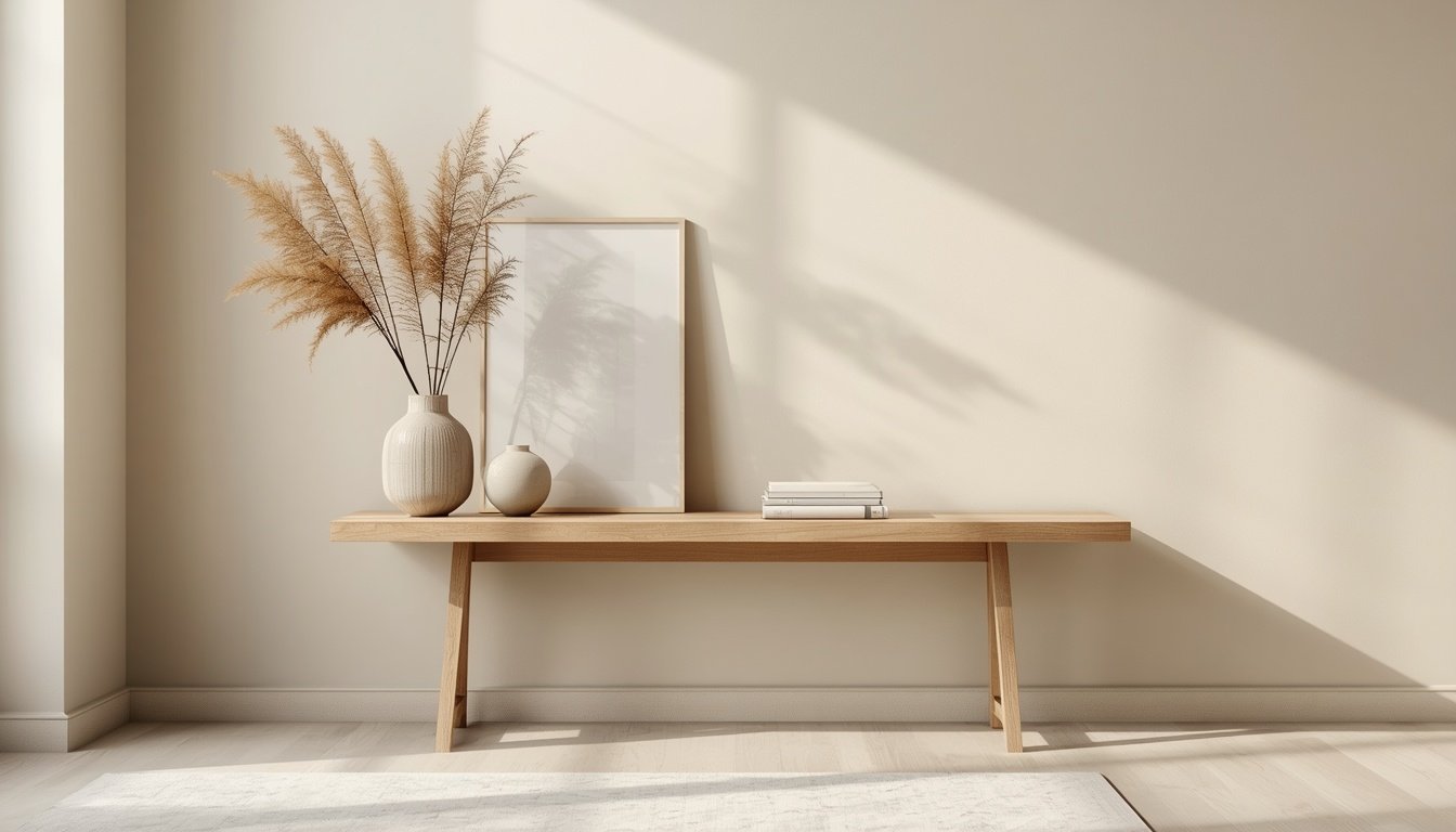
For example, a console table might hold a ceramic vase, a small stack of books, and a lamp, with enough open surface remaining to keep the arrangement from feeling crowded.
The same principle works in bedrooms. A neatly styled bedside table with a lamp and one useful accessory can feel calmer than a collection of unrelated objects.
Design tip: Use the question, “Does this piece add beauty, function, or personal meaning?” If the answer is no, consider removing it or placing it elsewhere.
9. Create Continuity Between Rooms
A warm neutral palette works especially well when it creates a subtle connection between different parts of the home.
You don’t have to use exactly the same colors everywhere. Instead, repeat a few foundational shades and materials so each room feels related to the next.
For example, warm ivory walls might connect the living room and hallway, while natural oak appears in the dining area and bedroom. Beige textiles can repeat across cushions, bedding, and curtains.
If you want to introduce a new color, bring it in through a few accessories rather than changing the entire palette.
This approach is especially useful in open-plan homes and small apartments, where several functional areas share one visual space.
Design tip: Choose one dominant neutral, one supporting neutral, and one or two accent materials. Repeating these elements creates continuity without making every room look identical.
Common Mistakes to Avoid with Warm Neutral Interiors
Using Only One Shade of Beige
A room filled with identical beige tones can feel flat. Introduce subtle differences through wood, textiles, ceramics, and varied neutral shades.
Choosing Paint Without Testing It
Neutral colors change with daylight, artificial lighting, and surrounding finishes. Always test samples in the actual room before painting the entire space.
Filling Every Empty Corner
Empty space is not wasted space. It allows furniture, artwork, and architectural features to stand out.
Buying Decor Without a Plan
Small decorative purchases can gradually create clutter. Choose items that fit your palette and contribute to the overall room.
Ignoring Furniture Proportions
Oversized furniture can overwhelm a room regardless of its color. Measure carefully and maintain comfortable walking routes.
Making the Room Too Perfect
A neutral home should still feel personal. Books, meaningful objects, favorite artwork, and comfortable textiles help create a space that feels lived in rather than staged.
Frequently Asked Questions About Warm Neutral Palettes
1. What colors are considered warm neutrals?
Warm neutrals include cream, ivory, beige, sand, taupe, warm greige, and some soft browns. Natural wood tones can complement these shades. The exact appearance depends on undertones, lighting, and surrounding materials.
2. How do I make a neutral room feel warm rather than cold?
Combine warm-toned paint with natural wood, soft textiles, layered lighting, and varied textures. Cream and beige can feel more inviting when balanced with linen, wool, ceramics, and a few earthy accents.
3. Do warm neutral colors make a small room look bigger?
Light warm neutrals can help a room feel brighter and visually open, particularly when natural light is available. However, the result also depends on furniture proportions, contrast, clutter, lighting, and layout. Color alone cannot make a cramped room feel spacious.
4. How many colors should I use in a neutral room?
There is no strict rule, but starting with two or three main colors is a useful approach. Add variation through materials, textures, and small accents rather than introducing many unrelated shades.
5. How can I add color without losing the calm neutral look?
Introduce restrained accents through cushions, artwork, plants, ceramics, or a throw. Muted olive, earthy terracotta, soft brown, and charcoal can work well with warm neutrals when used selectively.
6. What flooring works best with warm neutral interiors?
Natural oak, warm-toned wood, and flooring in complementary beige or soft brown shades can work beautifully. The right choice depends on your existing furniture, wall color, room lighting, and personal preferences. Test samples together before making a final decision.
7. How do I decorate a neutral room on a budget?
Start by editing the items you already own, rearranging furniture, and improving how accessories are displayed. Add affordable texture through cushion covers, throws, curtains, or woven baskets. You don’t need to replace every piece of furniture to create a calmer interior.
8. Can warm neutral palettes work with modern or minimalist interiors?
Yes. Warm neutrals suit minimalist interiors because they create visual continuity without relying on strong colors or elaborate decoration. They also complement modern furniture, clean lines, natural materials, and simple architectural details.
9. How do I keep a neutral room from looking boring?
Combine different textures, introduce a few contrasting shapes, use natural materials, and include objects with personal meaning. A neutral palette provides a foundation for variety; it doesn’t require every surface to match.
Final Thoughts: Make Room for What Matters
Creating visual breathing room isn’t about removing all color or decorating your home with nothing but beige. It’s about finding a thoughtful balance between the things you love and the space around them.
Warm neutral palettes offer a versatile foundation for this balance. When combined with natural materials, carefully chosen furniture, layered textures, and intentional styling, they can help a home feel calmer, more welcoming, and easier to live in.
Start with one room or even one surface. Edit the clutter, introduce a little texture, and let a few meaningful pieces take center stage.
A beautiful home doesn’t need to be filled with more things. Sometimes, it simply needs a little more room to breathe.
At A Little More Room Living, we believe thoughtful design can make everyday spaces feel more comfortable, functional, and personal.
Make Space for Better Living.